Food Colors
There is no denying that food looks good. Our eyes start to form opinions about it before we even take a bite. And food colours are at the top of this eye evaluation. Food colors—the bright colours of fruits and veggies, the deep browns of roasted meats, and the soft pastels of desserts—have a big impact on how we feel about taste, freshness, and even nutritional value. The psychology of food colours looks into how these visual cues affect our hunger, our hopes, and, in the end, how much we enjoy what we eat. Some food colours can make us feel and think of things right away, often because of our evolutionary past and cultural experiences. The bright red colour of a ripe strawberry might mean that it is sweet and ready to eat, while the mouldy green colour on bread tells us that it is going bad. The food industry is very aware of how powerful natural and artificial food colours can be, and they use them in smart ways to make goods look better and change people’s minds about what they want to buy.
Food colours are a silent but strong way to market, from the bright colours of packaged snacks to the careful plating in high-end restaurants. The food is presented visually—especially the colors—can have a big effect on our choice of what to buy. We can learn a lot about our eating habits and how our eye perception affects our food experiences by looking into the psychology behind food colours. This piece will go into great detail about the interesting world of food colours and how they have a big effect on how we feel about food.
A Guide to the Psychology of Food Colors
The way we see and respond to food colours is a complicated mix of natural responses and associations we have learnt. Understanding these neural processes can help us understand why and how we eat the way we do.
Food Color Psychology
Food colour psychology looks at how different colours affect how we see and feel about food. Even though each group is different, there are some general trends that can be seen:
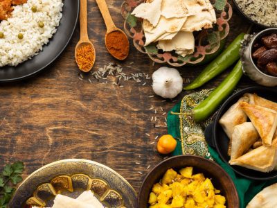
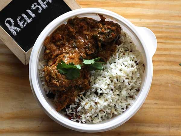
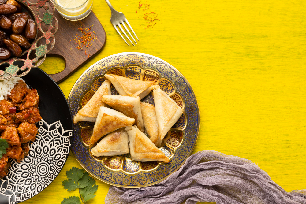
- Red: Often associated with ripeness, sweetness (like berries and apples), and energy. It can stimulate appetite and create a sense of excitement. In some contexts, it can also signal danger or spiciness.
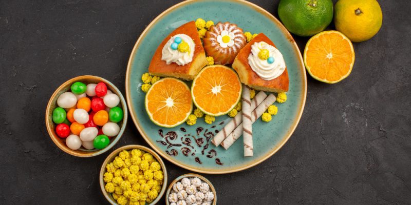
- Yellow: Typically evokes feelings of happiness, warmth, and optimism (think sunshine and lemons). It can also be associated with sweetness and ripeness (like bananas and corn).
- Orange: Combines the energy of red with the happiness of yellow, often perceived as appetizing, cheerful, and healthy (like oranges and carrots).
- Green: Strongly linked to freshness, naturalness, and health (like leafy vegetables and herbs). It can also evoke feelings of calmness and tranquility. However, certain shades of green can be unappetizing if associated with unripe or spoiled food.
- Blue: Relatively rare in naturally occurring foods (except for some berries), blue can be perceived as calming or even appetite-suppressing. It’s often used in artificial food colors for novelty items.
- Purple: Often associated with richness, sophistication, and sometimes artificial flavors (like grapes and some candies).
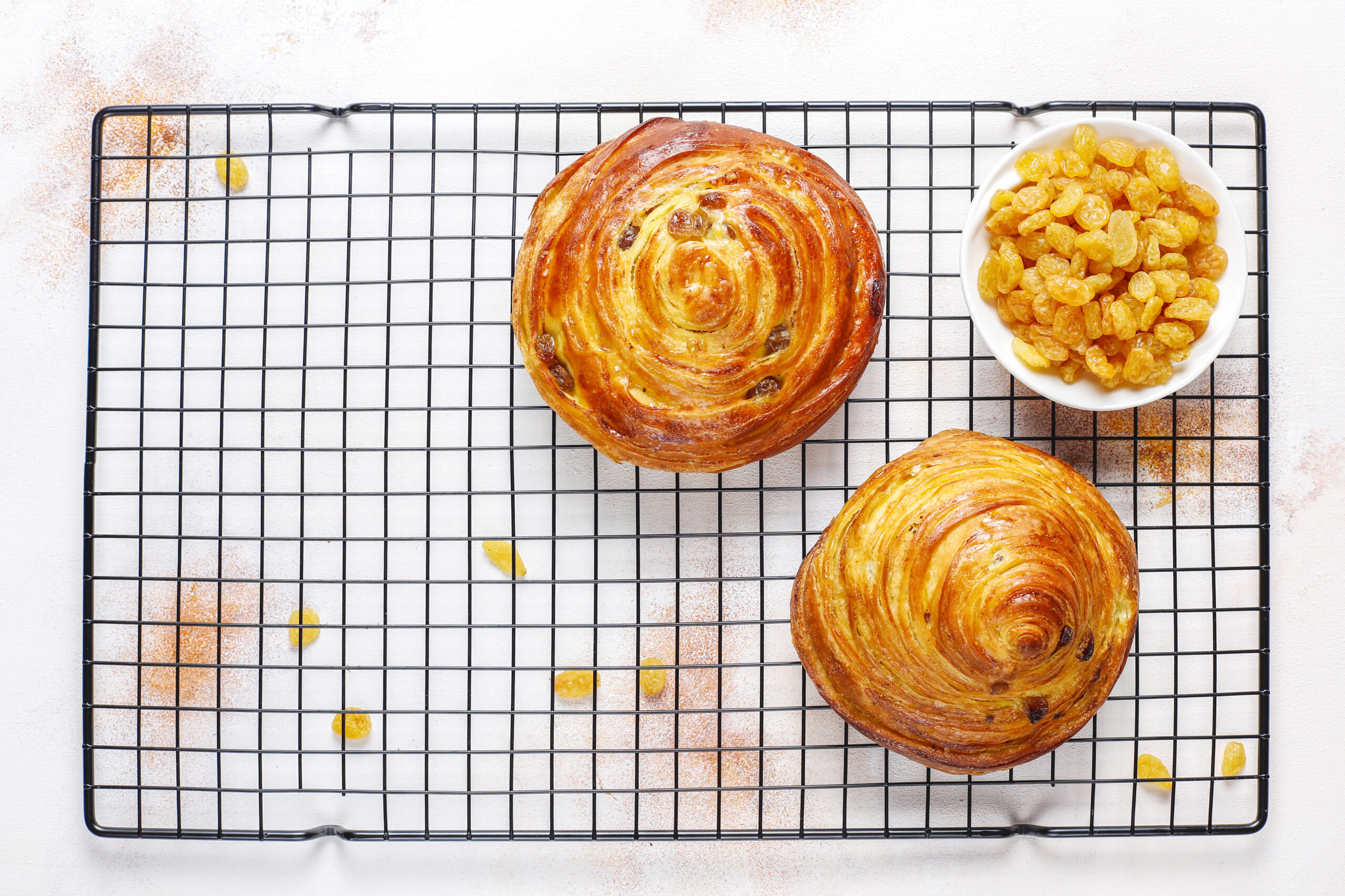
- Brown: Can evoke feelings of warmth, earthiness, and wholesomeness (like bread and roasted meats). However, overly brown food might be perceived as burnt or unappetizing.
- White: Can symbolize purity, cleanliness, and simplicity (like rice and milk). However, food that is entirely white might be perceived as bland.
- Black: Often associated with sophistication or intensity (like black truffles or dark chocolate). In some contexts, it can also signal burnt or spoiled food.
Understanding these broad psychological links between food colours can help you understand why some foods are naturally appealing and how colours are used in marketing and presentation.
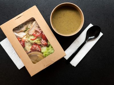
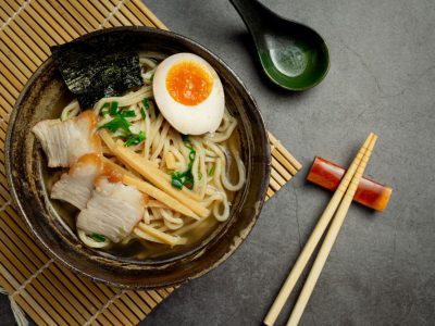
Visual Appetite
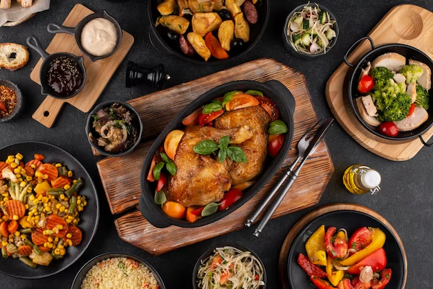
When you feel hungry and want to eat because of how food looks, this is called visual appetite. Food colours are a big part of making us hungry just by looking at them. Bright and vivid food colours, especially those that make us think of freshness and richness, can be very appealing and make us want to eat. People often think that food that is well-plated and has a range of colours that contrast with each other looks better than food that is all one colour. The food business relies on food colours to make people hungry by making products look better and marketing them. Think about how breakfast foods have bright colours or how glazed doughnuts are shiny.
Color Influence
Colour can do more than just make us hungry; it can also change how we taste and perceive flavours. Studies have shown that the colour of food can change what we expect from it and even how we feel about it. One example is that people might think a red drink tastes better or more like berries when it actually tastes the same as a clear one. In the same way, the depth of a food’s colour can change how rich or strong its flavour is. Food companies often use food colours to bring out the flavours they want (for example, yellow for lemon-flavored goods) or to make new products that look and taste good. The strong link between our sight and gustatory senses is shown by this colour effect.
Appetite Stimulation
One of the main goals of food marketing and presenting is to make people hungry, and food colours are a big part of doing this. Colours that are warm, like red, orange, and yellow, are often very good at making you hungry. This could have its roots in our evolutionary past, when these colours were linked to fruits and veggies that were ripe and full of energy. Using these food colours in restaurants in a smart way, like in the decor, the menu, and the way the food is served, can make people want to eat.
Summary
For some people, visual eating means taking in food with both their eyes and their mouths. Food colours have a big effect on how we see food, which is an important part of the whole eating experience. We make snap decisions about food based on how it looks, and these visual cues can have a big effect on how much we enjoy it. A dish that looks good can make us more excited and satisfied, while a dish that does not look good can take away from the experience, even if the food tastes good. In this day and age of social media, where food photos and sharing have become big parts of our culinary culture, visual eating is even more important. Food’s “Instagram-worthiness” is often based on how pretty it looks, which is mostly decided by its colours and presentation. This can change trends and preferences.
The psychology behind food colours is strong and often goes unnoticed, but it changes the way we feel about food. The way we naturally feel about certain colours and the way food is marketed and presented all use our visual sense to affect what we want to eat, what we expect, and how much we enjoy it. Understanding the psychology of food colour, the rules of visual hunger, and the subtle ways that colour affects how we taste things can help us understand how we eat. It is easy to get lost in the world of food, both online and off. Knowing the power of food colours can help us make better decisions and understand how our senses and your food experiences work together.
A food enthusiast and a blogger – someone who likes to eat and write about it. I’m passionate about exploring different cuisines and challenging my palette. I give into my food craving regularly and am often on the hunt to find my new favorite food place in town.